Lean Group Solutions

Project Overview
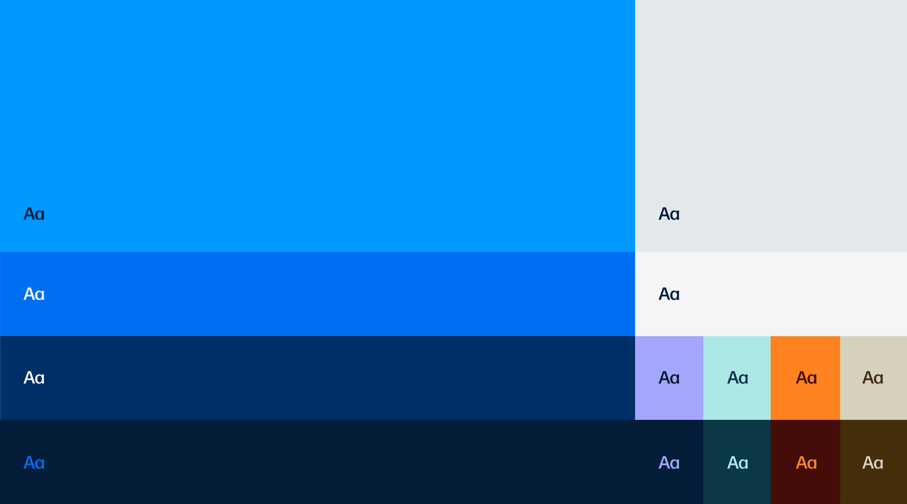
Lean Solutions Group needed a brand system that could flex across every touchpoint without losing its core — dynamic enough to adapt, consistent enough to own. I led the full creative direction of the visual identity. The system was built from a clear strategic foundation: a brand idea rooted in embedded expertise and forward momentum. The chevron icon was designed to carry that idea visually — a symbol of progress and direction, applied consistently from digital to print. Typography, color, and layout were defined as a modular system, allowing the brand to scale across social media, presentations, web, and internal communications while remaining immediately recognizable. The result is a living, modular system. Precise in its rules, flexible in its expression.
Industry
Business
Category
Brand Identity




Related Projects
03

